How to Reduce Shopping Cart Abandonment and Boost Conversions
Learn how to reduce shopping cart abandonment with actionable UX, CRO, and retargeting strategies. Turn lost sales into revenue with our expert guide.

Shopping cart abandonment is more than a metric; it's a direct leak in your revenue pipeline. For marketing leaders and business owners, plugging this leak is one of the highest-impact levers for immediate growth.
Every abandoned cart represents a customer who was moments away from a purchase. They demonstrated clear intent by adding your product to their cart. The breakdown happened at the final, most critical stage. The key isn't just to notice it, but to understand the financial opportunity it represents.
The Hidden Revenue Drain in Your Shopping Carts
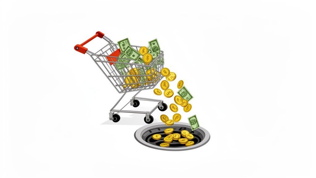
The scale of cart abandonment is staggering. The average rate across e-commerce hovers around 75.38%, translating to an estimated $4.6 trillion in lost sales annually.
This isn't just a sunk cost. A significant portion of that lost revenue is recoverable. With the right strategies, businesses can reclaim up to $260 billion of those sales. That's not just growth; it's found money.
Key Cart Abandonment Statistics at a Glance
For business leaders, these numbers translate directly to strategic imperatives. This table breaks down the metrics and their implications for your P&L.
These figures show that cart abandonment isn't just a "cost of doing business." It's your single biggest opportunity for growth waiting to be seized.
Shifting from a Problem to an Opportunity
Instead of viewing abandonment as a loss, frame it as your lowest-hanging fruit for boosting revenue. Acquiring a new customer is expensive; re-engaging a high-intent shopper who already wants your product is far more efficient and delivers a higher ROI.
A methodical, four-part process is essential:
- Diagnose: Use analytics and user behavior tools to find exactly where and why users drop off.
- Prioritize: Identify the fixes that offer the highest potential ROI. You can't fix everything at once.
- Implement: Roll out targeted improvements—streamlining forms, adding payment options, optimizing mobile UX.
- Measure: Track key metrics like conversion rate and average order value. A/B test changes to validate their impact.
This entire journey—from cart addition to abandonment and recovery—is a critical flow to master.
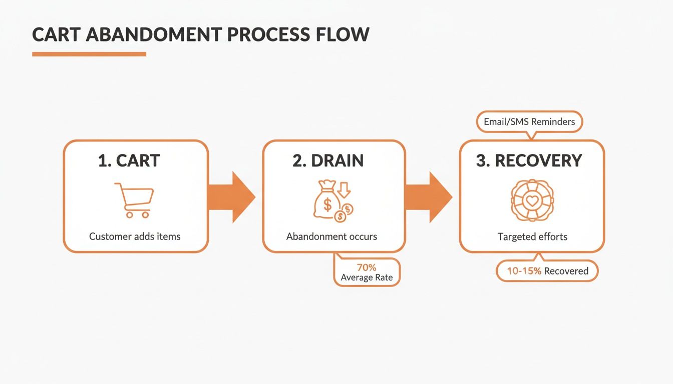
As the diagram shows, recovery isn't just an afterthought. It's a fundamental part of a healthy sales funnel, designed to capture revenue that would otherwise vanish.
At its core, tackling cart abandonment is a conversion rate optimization (CRO) exercise. Small, iterative improvements to the checkout experience deliver compound returns. This principle is central to our work at Ezca, where we've engineered checkout flows that have lifted client revenue by double-digit percentages.
Ready to plug the leaks in your funnel? For a deeper dive, check out these 10 Proven Strategies to Reduce Shopping Cart Abandonment. Understanding the "why" behind abandonment is the first step toward turning that hidden drain into your next big growth channel.
Pinpointing Why Your Customers Are Leaving
Applying generic fixes to your cart abandonment problem is a recipe for wasted resources. A data-first approach is the only way to identify the specific friction points unique to your store and audience. This means trading assumptions for evidence.
Instead of guessing that shipping costs are the issue, use analytics to see the precise moment users exit. This ensures your development and marketing efforts are focused on solving real problems that impact the bottom line—a core principle of our growth sprints at Ezca.
Digging into Your Funnel Analytics
Your analytics platform, like Google Analytics, is your primary diagnostic tool. The first step is to map your checkout funnel: from adding an item to the cart, through entering shipping and payment details, to the final confirmation.
Visualizing this flow will immediately highlight the biggest leaks.
If you see a 40% drop-off after the shipping page loads, that's a clear signal. The prime suspects are unexpected costs or a lack of delivery options.
The real insights emerge when you segment this data. Go beyond the aggregate numbers:
- By Device: A significantly higher abandonment rate on mobile points directly to a poor user experience—clunky forms, slow load times, or a lack of mobile-friendly payment options like Apple Pay.
- By Traffic Source: If visitors from a specific ad campaign are abandoning at a high rate, there's likely a mismatch between your ad creative and the on-site experience.
- By Customer Type: Are new customers leaving more often than returning ones? This could indicate that forced account creation is a major barrier, or that your guest checkout is not prominent enough.
Gaining Qualitative Insights with User Behavior Tools
Analytics tell you what is happening, but qualitative tools tell you why. To understand the user experience, you need to see your site through your customers' eyes.
The most powerful insights often come from watching someone struggle. A five-second clip of a user rage-clicking a broken button is more compelling than any spreadsheet and immediately clarifies what needs to be fixed.
Heatmaps from tools like Hotjar or Crazy Egg show where users are clicking, scrolling, and hovering. They can reveal usability issues like non-clickable elements that look like buttons or critical information placed below the fold where users aren't seeing it.
Session recordings provide a DVR-like replay of individual user visits. Watching a user get stuck in a loop, struggle with a form field, or abandon the process in frustration offers priceless, firsthand evidence of friction points that data alone cannot reveal. For more strategies, check out this guide on how to reduce cart abandonment.
Finally, exit-intent surveys offer direct feedback at the moment of abandonment. A simple pop-up asking "What's stopping you from completing your purchase today?" can yield actionable insights about shipping costs, technical bugs, or trust concerns.
Streamlining Your Checkout Flow to Eliminate Friction
The checkout flow is the final hurdle between a prospect and a customer. Even minor friction here can have an outsized impact on revenue. A clunky, confusing, or untrustworthy process is the leading cause for high-intent shoppers to abandon their purchase.
Think of it as the last 100 meters of a marathon. Your job is to make crossing the finish line effortless. Every unnecessary field, surprise cost, or moment of confusion introduces doubt at the worst possible time.
The Power of Guest Checkout
Offering a prominent guest checkout option is one of the highest-impact changes you can make. Forced account creation is a notorious conversion killer. While unexpected costs drive 55% of abandonments, a significant 34% of users will leave if required to create an account.
Make guest checkout the default, most visible choice. You can always prompt users to create an account after the sale is complete, using their entered information to make it a one-click process. This simple shift removes a massive barrier.
Designing a User-Friendly Checkout Form
The design of your checkout forms is critical. The goal is to guide users through the process with a clear sense of momentum, not present them with an intimidating wall of fields.
- Stick to a Single-Column Layout: This creates a clear, predictable path for the user's eye, reducing cognitive load and minimizing the risk of missing required fields.
- Show Them the Finish Line: A simple progress indicator (e.g., "Shipping > Payment > Review") manages expectations, reduces anxiety, and shows users how close they are to completion.
- Let the Browser Do the Work: Ensure your form fields use standard HTML attributes so browsers can autofill addresses and contact information. This saves significant time and effort, especially on mobile.
A clean checkout isn't just about aesthetics; it's about psychology. By reducing the number of decisions and actions a user must take, you lower their cognitive load. A simple, linear path builds momentum and makes completing the purchase feel like the natural next step.
Building Confidence with Trust Signals
The checkout process is a test of trust. A customer needs to feel completely confident that their financial data is secure and your business is legitimate. Integrating trust signals throughout the checkout is non-negotiable.
Essential Trust Signals for Your Checkout:
Implementing these elements is a cornerstone of conversion rate optimization. At Ezca, we’ve seen firsthand how a well-structured and trustworthy checkout can dramatically lift conversion rates. To see more of our tactical advice, you can learn about our approach to e-commerce checkout optimization.
Optimizing for the Mobile Checkout Experience
A mobile-first e-commerce strategy is no longer optional. A poor mobile experience is a direct cause of lost sales, as consumers increasingly shop exclusively on their phones. This requires fundamentally rethinking the purchase journey from a mobile perspective.
The data is clear: mobile devices have the highest abandonment rate at 75.50%, which is 5.31% higher than the global average and significantly worse than the 69.04% on desktops. When you dig into these critical shopping cart statistics, the financial impact of a subpar mobile experience becomes impossible to ignore.
Designing for Thumbs, Not Cursors
Mobile interfaces must be designed for thumbs. Tiny text links, cramped form fields, and buttons packed too closely are recipes for frustration and errors.
- Generous Tap Targets: Ensure all buttons, links, and interactive elements are large enough for easy tapping. A minimum size of 48x48 pixels is the recommended standard.
- Smart Keyboards: Automatically trigger the numeric keypad for fields like phone numbers, zip codes, and credit card details. This small detail dramatically improves the user experience.
- A Clear Path to Purchase: Strip out all non-essential elements from the mobile checkout screen. No distracting banners or unnecessary navigation. The user should have one obvious action: complete the order.
Cut Out the Typing with Digital Wallets
The most effective way to reduce mobile friction is to eliminate typing. Integrating one-click digital wallets is a business imperative.
Offering options like Apple Pay, Google Pay, and PayPal allows customers to bypass manual entry of shipping and payment information. A quick fingerprint or face scan completes the transaction. It's fast, secure, and meets modern shopper expectations.
The ROI on integrating digital wallets is almost immediate. We worked with a client who added Apple Pay and Google Pay, cutting their checkout completion time by over 60%. Their mobile conversion rate jumped 12% in the first month alone.
Page Speed Is a Conversion Metric
On mobile, speed is a foundational element of the user experience. Sites that take more than three seconds to load on mobile see abandonment rates spike by 44%.
Treat mobile page speed as a top-tier business metric. Use tools like Google's PageSpeed Insights to diagnose and fix issues like uncompressed images, slow server response times, or inefficient code.
Because of its direct impact on revenue, prioritizing the mobile experience is a key focus for performance agencies like Ezca. Stop thinking of your mobile checkout as a shrunken version of your desktop site. Treat it as its own unique, high-stakes funnel.
Mobile vs Desktop Checkout Optimization Checklist
While the goal is the same, the tactics for mobile and desktop differ. This checklist highlights key optimization differences.
Tailoring the experience to the user's context is key. A mobile user values speed above all, while a desktop user may be more tolerant of extra fields.
Winning Back Sales with Smart Recovery Campaigns
An abandoned cart is a high-intent lead. This user wanted your product enough to add it to their cart. A robust recovery engine is a direct path to boosting your bottom line by re-engaging these valuable prospects.
The most effective approach is multi-channel. Email is the foundation, but layering it with paid retargeting creates a powerful system that guides customers back to purchase, wherever they are online. The key is to be helpful and relevant, not intrusive.
Your recovery strategy must meet modern shoppers in their digital environment, whether it's their inbox or social media feed.
Crafting a High-Converting Email Sequence
Abandoned cart emails can recover anywhere from 3% to 14% of lost sales. A single, generic email is not enough. A carefully timed, multi-email sequence is where the real ROI is found.
- Email 1 (Send 1-3 hours after abandonment): A friendly, low-pressure nudge. The tone should be helpful. Use a subject line like "Did you forget something?" and include large, clear images of the cart items with a single call-to-action button to return to the checkout.
- Email 2 (Send 24 hours later): Increase urgency or build confidence. Mention your return policy, showcase customer reviews for the items in their cart, or note that a product is a bestseller. This helps overcome last-minute hesitation.
- Email 3 (Send 48-72 hours later): This is your final attempt and where a strategic incentive can be effective. A small discount, such as 10% off or free shipping, can be the final push needed. Use this tactic judiciously to avoid training customers to expect discounts.
Pro Tip: Track the Revenue Per Recipient (RPR) for each email in your sequence. If Email 3 generates a high unsubscribe rate with low revenue, it may be more profitable to remove it and stick to a two-email flow. Let the data drive your strategy.
Amplifying Recovery with Paid Retargeting
For users who abandon before providing an email address, paid retargeting on platforms like Facebook, Instagram, and Google is essential.
Dynamic Product Ads (DPAs) are the most effective tool for this. They automatically display the exact products a user left in their cart, creating a highly personal and relevant ad experience. This focuses your ad spend on your highest-intent audience for maximum ROI.
A Dynamic and Integrated Approach
Effective recovery strategies integrate email and paid advertising. Use suppression lists to ensure that once a customer completes a purchase via an abandonment email, they are immediately removed from your retargeting audiences. This saves ad spend and prevents a negative customer experience.
At Ezca, we use this dynamic approach to optimize recovery for our clients. We continuously monitor the Return on Ad Spend (ROAS) for each channel—email, social ads, search retargeting—and reallocate budget to the top-performing tactics in real-time.
To see how we've engineered these systems for other brands, explore our ecommerce email revenue engine.
Your Top Cart Abandonment Questions, Answered
Even with a solid game plan, you're bound to run into some specific challenges when fighting cart abandonment. Let's tackle some of the most common questions I hear from business owners and marketers.
What Is a Good Cart Abandonment Rate to Aim For?
While the global average is around 75%, a "good" rate is highly contextual and varies by industry. A travel site will naturally have a higher abandonment rate than a commodity goods store due to the complexity of the purchase decision.
Instead of chasing an arbitrary industry benchmark, focus on your own data. A more actionable goal is to aim for a 15-20% reduction in your current abandonment rate over the next quarter. This provides a clear, measurable target tied directly to your bottom line.
How Do I Calculate the ROI of My Recovery Efforts?
Measuring the ROI of your recovery campaigns is crucial to justifying the investment and optimizing your strategy.
The formula is straightforward:
- Recovered Revenue: Total sales value directly attributed to your recovery campaigns (email, SMS, retargeting ads).
- Cost of Efforts: Sum of all costs, including email platform fees, ad spend, and any specialized recovery tools.
- ROI Formula:
(Recovered Revenue - Cost of Efforts) / Cost of Efforts * 100
For example, if you recovered $10,000 in sales with $1,500 in costs, your ROI is 567%. Tracking this metric proves the value of your recovery engine.
Is Offering a Discount the Best Way to Recover a Cart?
Discounts are a powerful but risky tool. Overusing them can train customers to abandon carts intentionally to receive a coupon, eroding your profit margins.
A tiered email sequence is a smarter strategy:
- First Email (1-3 hours later): A simple reminder with no discount.
- Second Email (24 hours later): Build confidence by highlighting reviews, guarantees, or your return policy.
- Third Email (48-72 hours later): If the cart is still abandoned, introduce a modest incentive like 10% off or free shipping.
This approach recovers many carts without a discount, saving the incentive for the most price-sensitive shoppers.
A discount is often a bandage on a deeper issue. The root cause is typically friction in the checkout process—unexpected costs, a confusing form, or a lack of trust. Solving these core UX problems provides a far greater and more sustainable lift in conversions than any temporary coupon code can.
How Soon Should I Send an Abandoned Cart Email?
Timing is critical. The first recovery email should be sent within 1-3 hours of abandonment.
In this initial window, purchase intent is still high. A quick, friendly reminder can bring them back before they forget or purchase from a competitor. Waiting 24 hours is a common mistake; by then, the buying impulse has significantly faded. Data consistently shows that emails sent within the first few hours have the highest open and conversion rates.
At Ezca Agency, we help brands turn abandonment issues into growth opportunities. Our data-driven, 90-day sprints focus on optimizing every stage of your funnel—from checkout flow to recovery campaigns—to maximize your revenue. See how our performance marketing approach can help you reclaim lost sales.