A Guide to User Experience Optimization That Drives Growth
Unlock scalable growth with our guide to user experience optimization. Learn actionable strategies for leaders to boost ROI, conversions, and customer loyalty.

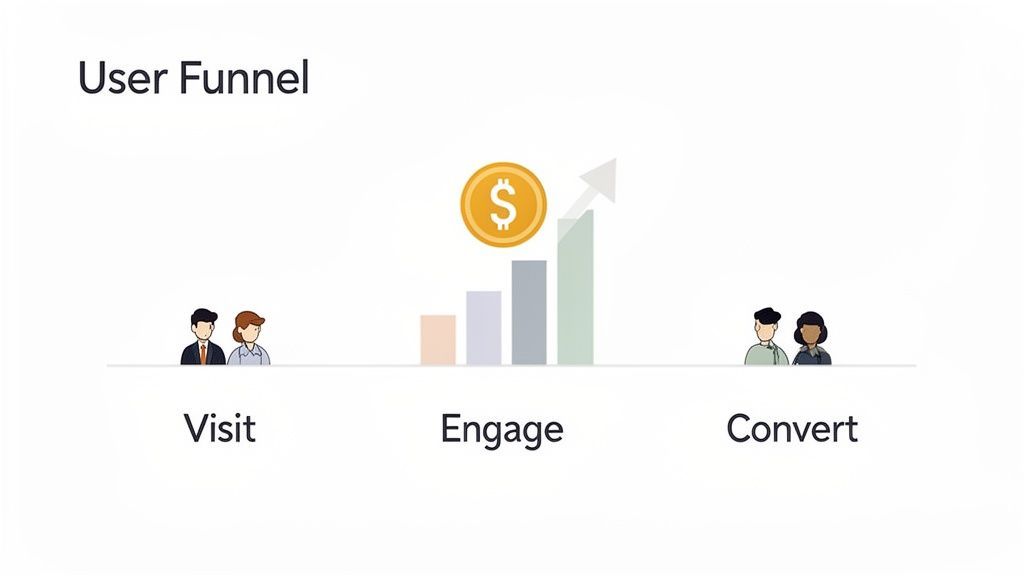
User experience optimization is about making your website easier to use so more visitors convert into customers. It’s an ongoing process of understanding what your users need—using real data and user behavior to make decisions, not just hunches. For marketing leaders and business owners, it's about turning your existing traffic into more revenue.
Why User Experience Optimization Is Your Highest ROI Investment
As a marketing leader, every dollar must drive a return. While paid ads and SEO grab attention, user experience optimization consistently delivers the highest ROI. It acts as a force multiplier, making every other marketing effort more effective by ensuring the traffic you acquire actually converts.
This isn't about cosmetic changes. It’s a strategic discipline focused on identifying and removing the friction points that kill conversions, inflate acquisition costs, and damage your brand.
Connecting UX Improvements To Business Growth
A smooth, intuitive user journey directly impacts your bottom line. When users can easily find what they need and complete their goals, key business metrics improve.
Consider a typical customer path: they click an ad, land on a product page, and head to checkout. A single confusing form field or a slow-loading page can cause them to abandon the process. Just like that, you’ve wasted your ad spend and lost a customer.
By systematically identifying and smoothing out these friction points, you turn more visitors into loyal customers. This directly grows revenue, improves lead quality, and builds a brand people trust.
The data is clear: for every $1 invested in UX, the return can be as high as $100—an ROI of up to 9,900%. At Ezca, we've seen e-commerce sites boost conversions over 35% just by redesigning a clunky checkout process. That’s the power of removing friction where it matters most.
Key UX Optimization Metrics And Their Business Impact
Tracking the right metrics moves you beyond guesswork and into data-driven decisions that deliver tangible results. For business owners, this table connects UX metrics to direct business outcomes.
A Continuous Process, Not A One-Off Project
Market leaders treat UX as an ongoing process, not a "set it and forget it" task. Customer expectations change, technology evolves, and your business goals shift. Your website must keep pace.
To achieve sustainable results, you must integrate current user experience best practices into your core strategy. This means creating a continuous cycle of diagnosing issues, forming smart hypotheses, and testing solutions.
This iterative approach is central to our 90-day marketing sprints at Ezca. We weave UX optimization into every initiative, ensuring your entire marketing funnel—from ad creative to landing page—is constantly refined based on real user behavior. It's the most reliable way to maximize your marketing ROI.
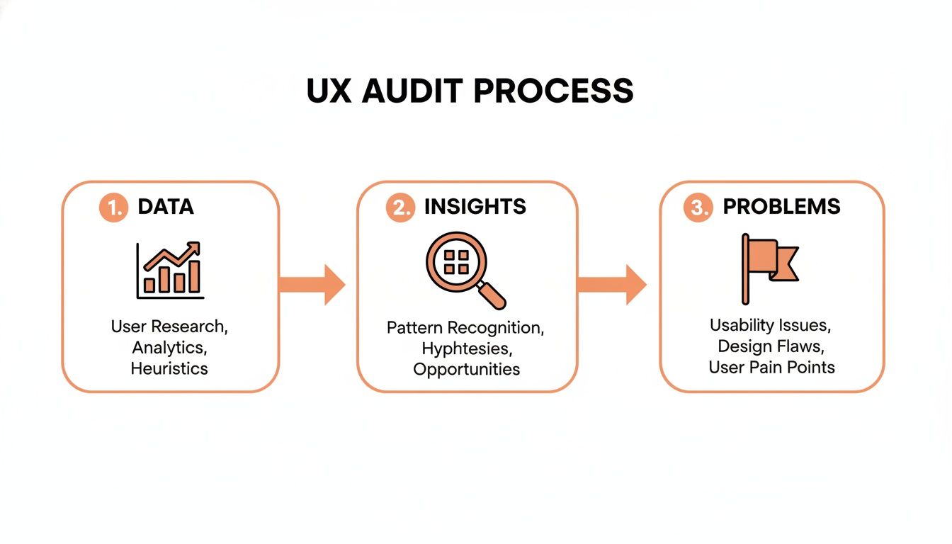
Your Data-Driven UX Audit Framework
Jumping into redesigns or A/B tests without a proper diagnosis is a recipe for wasted resources. Before you can improve your user experience, you must understand exactly where it’s failing. A real audit combines quantitative data (the "what") with qualitative insights (the "why") to reveal actionable opportunities.
I've seen too many teams operate on gut feelings. The most effective approach is always a blend of analytics, which shows user behavior at scale, and direct user feedback, which uncovers the motivations behind that behavior.
Start with the Numbers: Finding the "What"
First, follow the digital trail your users leave behind to pinpoint drop-off points and areas of friction. This is how you find the symptoms of a poor user experience.
Your web analytics platform (e.g., Google Analytics) is your starting point. Look for numbers that signal trouble:
- Where are people bailing? High exit rates on critical pages like pricing or checkout are major red flags. If 50% of users leave your pricing page, you have a clarity or value proposition problem.
- Which funnels are leaking? Set up goal funnels for key journeys (e.g., purchase, sign-up). A sharp drop-off between steps is a clear signal of where to focus. For example, a 70% drop from "add to cart" to "begin checkout" points to a specific issue.
- How do different groups behave? Segment your data by device, traffic source, or user type. You might discover your mobile checkout flow is failing 80% of users, even if the desktop version works fine.
Behavior analytics tools add a visual layer. You can use a heat map on your website to see exactly where people click and how far they scroll.
Session recordings let you watch anonymized videos of real user sessions. This is where you’ll spot things numbers can’t show you, like a user "rage clicking" a broken button in frustration.
Get the Story: Discovering the "Why"
Numbers tell you what’s happening, but they rarely tell you why. For that, you need qualitative feedback directly from your users. This is the step most teams skip, but a few targeted conversations can save you months of guesswork.
You can A/B test a button's color a dozen times, but a single 15-minute user interview might reveal the button's text is confusing, making all your tests irrelevant. Qualitative feedback provides the context that makes your data actionable.
Even with a limited budget, you can get started:
- Conduct User Interviews: Talk to 5-7 people from your target audience. Ask them to perform a task on your site while thinking aloud. Ask, "What was going through your mind on this page?"
- Run On-Site Surveys: Use simple pop-up polls on key pages. On a high-exit pricing page, ask, "What's the one thing stopping you from signing up today?" The brutally honest feedback is invaluable.
- Analyze Support Tickets: Your customer support logs are a goldmine. Recurring questions or complaints often point directly to confusing design, missing information, or broken features.
By combining quantitative and qualitative findings, you build an evidence-based list of problems. This audit becomes the foundation of your entire user experience optimization program, ensuring every change is aimed at solving a genuine customer issue and driving growth. To get more visitors to your optimized site, check out our guide on how to increase organic traffic.
Building Your High-Impact Experiment Roadmap
An audit often produces a long list of issues. The challenge isn't finding problems; it's prioritizing them to create a strategic roadmap that aligns with your business goals. Without a solid framework, teams often tackle the easiest tasks or follow the loudest opinion, burning resources on low-impact work.
A good prioritization framework turns subjective debates into an objective, ROI-driven plan for user experience optimization.
Prioritizing With the PIE Framework
A simple but effective tool is the PIE framework. It helps you score each potential fix against three criteria: Potential, Importance, and Ease. Score each from 1 (low) to 10 (high).
- Potential: How much improvement can you realistically expect? A fix on a high-traffic checkout page has massive potential compared to a tweak on a rarely visited "About Us" page.
- Importance: How critical is this page or flow to your business? A broken lead form on a key service page is far more important than a typo on an old blog post because it directly impacts revenue.
- Ease: How much time and effort will this take to implement and test? Consider design, development, and QA. A simple copy change is a 10 for ease; a full checkout redesign might be a 2.
Add the scores (P + I + E). The ideas with the highest totals become your top priorities. This creates a defensible roadmap and focuses your team on what matters.
The PIE framework is your defense against "shiny object syndrome." It forces a conversation about business value versus effort, ensuring you tackle what's impactful, not just what's easy.
With a prioritized list, you can craft experiments to validate your ideas.
Crafting Testable Hypotheses
A strong hypothesis isn’t just an idea—it’s a specific prediction that connects a proposed change to a measurable outcome. It defines success before you start and aligns your team.
Use this structure: "By [making this specific change], we predict [this measurable outcome] because [this reason based on our research]."
Here are some real-world examples:
- E-commerce: "By replacing our multi-step checkout with a single-page accordion checkout, we predict a 15% increase in completed purchases because user session recordings showed significant drop-off at each step."
- SaaS: "By adding a 'No credit card required' badge to our trial signup form, we predict a 20% lift in trial signups because user surveys revealed that requiring a credit card was the #1 hesitation."
- B2B Lead Gen: "By changing the primary CTA on our services page from 'Learn More' to 'Get a Custom Quote', we predict a 30% increase in form submissions because heatmaps show users are actively looking for pricing information."
This structured approach is central to how we run things at Ezca. It's a discipline that forces clarity for any team serious about user experience optimization. See this approach in action in our case study on successful e-commerce checkout optimization.
How to Execute and Measure Your UX Experiments
With a prioritized roadmap and clear hypotheses, it's time to execute. This is where strategy meets reality. Your primary tools are A/B testing (for quantitative validation) and qualitative user testing (for the "why").
Proper execution is critical. A poorly run experiment is worse than no experiment at all because it provides misleading data, leading to bad decisions. Ensure your results are statistically significant by using enough traffic and running the test long enough to account for weekly fluctuations. Calling a test early because one version is slightly ahead is a common mistake that leads to false conclusions.
A/B Testing Vs Qualitative Testing Which To Use When
So when should you use an A/B test, and when is qualitative feedback better? You need both. This table clarifies when to use each method.
These methods work in a loop: qualitative sessions spark ideas for A/B tests, and A/B test results raise new questions that qualitative testing can answer.
Measuring What Truly Matters for ROI
As a business leader, every initiative must tie back to ROI. A lift in conversion rate from 2% to 2.5% is a clear win, but you must also track KPIs that demonstrate broader business impact.
Go beyond simple conversion rates and measure:
- Task Success Rate: What percentage of users can complete their goal? If only 60% of users can successfully use your "request a quote" form, you're leaving money on the table.
- User Error Rate: How often do users encounter errors? A high error rate on a form indicates confusing design and directly causes abandonment.
- Customer Satisfaction (CSAT) Scores: A quick post-purchase survey provides direct user sentiment, a strong predictor of loyalty and repeat business.
The real power comes from connecting these metrics to financials. Proving that a 10% drop in user errors on your checkout form led to a 5% increase in completed purchases and a 20% reduction in related support tickets is a powerful story for any boardroom. This is a core deliverable of a professional conversion rate optimization (CRO) service.
The Critical Role of Mobile Optimization
Nowhere are these metrics more vital than on mobile. An estimated 85.65% of mobile shoppers abandon their carts, almost always due to a clunky, frustrating mobile experience.
With over 65% of all digital media time spent on mobile, it's astonishing that 96% of users report encountering sites not designed for mobile. At Ezca, we view this as a massive opportunity for our clients, having helped them generate over $100M+ in tracked revenue by focusing on mobile UX. You can find more e-commerce UX statistics in this detailed report.
Integrating UX Into Your Marketing Sprints
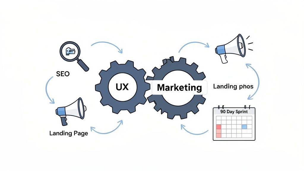
True growth happens when user experience optimization becomes part of your marketing team’s DNA. The most successful marketing leaders weave UX through every initiative, from paid campaigns to SEO. It’s not a separate function; it's a core discipline.
When UX is siloed, you create a disjointed customer journey. Integrating UX into your regular marketing sprints breaks down those silos and creates a powerful feedback loop that makes every part of your funnel smarter.
Fueling Paid Media With UX Insights
Running paid ads without a tight UX feedback loop is an expensive way to discover your website doesn’t work. You can spend a fortune on clicks, but if the landing page is a dead end, that money is wasted. This is where UX directly impacts your acquisition costs.
Imagine your user testing reveals that customers are confused by your pricing. This is gold for your ad team. They can now write ads that address that confusion head-on, pre-qualifying visitors before you pay for the click.
This synergy delivers real ROI:
- Better Ad Copy: User interviews provide the exact language your customers use. Using their words in your ads creates an instant connection.
- Higher Quality Scores: Google rewards you when your ad, landing page, and user experience are aligned. A higher Quality Score lowers your Customer Acquisition Cost (CAC).
- Optimized Landing Pages: Heatmaps and session recordings show you what’s working on your page. This data-driven approach helps you build landing pages that convert at a much higher rate.
This process transforms your ad budget from an expense into an efficient customer acquisition machine.
Every piece of qualitative feedback—every frustrated user comment uncovered in a usability test—is a roadmap for creating better ads and landing pages. It’s the secret to stopping the campaign-to-bounce cycle.
This is fundamental to the 90-day sprint model at Ezca. We don’t just manage ad spend; we ensure the entire user journey is airtight to guarantee the best possible return on your marketing dollars.
Boosting SEO With a Superior User Experience
SEO is no longer just about keywords and backlinks. Google’s algorithms now prioritize Search Experience Optimization. They favor websites that not only have the right content but also deliver an outstanding user experience.
When a user lands on your site from a search result, Google watches their behavior. Do they stay, or do they immediately hit the back button ("pogo-sticking")? These engagement signals are powerful ranking factors.
A great user experience sends all the right signals to Google:
- Lower Bounce Rates: A well-designed page that meets user intent keeps them from leaving, signaling to Google that your page is a quality result.
- Longer Dwell Time: When users spend more time on your page and explore other content, it signals engagement and value.
- Higher Click-Through Rates: An intuitive site structure encourages exploration, which tells search engines you are a valuable resource.
Every UX improvement—from improving page speed to clarifying navigation—doubles as an SEO improvement. In an age of AI-driven search, a frictionless experience is not optional. A site that’s a pain to use will not be seen as a trusted authority, and its organic rankings will suffer.
Common Questions About User Experience Optimization
For marketing leaders and business owners, it's important to understand how a formal user experience optimization program fits into your growth strategy. Here are answers to the practical questions we hear most often.
How Much Does User Experience Optimization Typically Cost?
The investment is a spectrum, depending entirely on your goals.
A small, targeted project can cost a few thousand dollars. This is a surgical strike—auditing a single critical flow like your checkout process and running one high-impact A/B test to fix the biggest friction point.
A comprehensive, ongoing program is a more significant investment. This is the approach we recommend at Ezca, where we embed UX optimization directly into your marketing sprints. It’s a continuous cycle of research, testing, and iteration across the entire customer journey.
The real question isn't about cost, but ROI. A well-executed user experience optimization program should deliver a clear, positive return by boosting conversion rates, increasing customer LTV, and lowering acquisition costs. It's designed to pay for itself many times over.
How Long Does It Take to See Results From UX Improvements?
The timeline for results depends on the scope of the change. Simple fixes can deliver a payoff almost immediately.
For example, fixing a broken button on your mobile checkout page can lead to a measurable lift in sales within 24-48 hours. We’ve seen similar quick wins from rewriting a confusing call-to-action on a high-traffic landing page.
Larger, strategic changes require more time. A complete overhaul of a core user flow, like onboarding a new SaaS customer, is more involved. From our experience, a project like this typically breaks down as:
- Discovery & Hypothesis: 1-2 weeks
- Design & Development: 3-4 weeks
- Testing & Measurement: 2-4 weeks
A 90-day sprint is an ideal timeframe for a substantial UX initiative, providing enough time to execute properly and measure real-world impact. The goal is to stack these incremental gains over time for a lasting competitive advantage.
Can I Do UX Optimization Without a Dedicated Designer?
Yes. While a dedicated UX designer is ideal for a mature program, it's not a prerequisite for getting started.
The most important step is shifting your mindset to make decisions based on user data, not assumptions. Start with accessible tools like Hotjar to access heatmaps and session recordings, which reveal where users get stuck. Simple on-site surveys can gather direct feedback.
Once you’ve identified problems, you can run simple A/B tests to validate your solutions. As your program matures and you face more complex usability challenges, you can bring in a specialist, whether it's a freelancer or an agency partner like Ezca.
At Ezca Agency, we build this entire process into our 90-day sprints, making sure every marketing dollar you spend is amplified by a world-class user experience. If you’re ready to turn UX insights into measurable growth, we should talk. See how our data-driven approach works at https://ezcaa.com.